Accessibility, connect and fit into its environment

Ruland Architects gives design vision for three stations

For the tender Rural Accessibility Tranche 4,  Ruland Architects made in collaboration with Structon WorkSphere three sketch designs for the full accessibility of three stations. The three sketches are an elaboration of the design vision with a clear consideration of aesthetics, manufacturability and cost.


Each location will be offered a comprehensive solution that meets the technical design requirements of ProRail and the added value created by the integration of both the interests of all users of the station and the interests of the immediate area.

For further developement the choice was made for a design by another contestant.

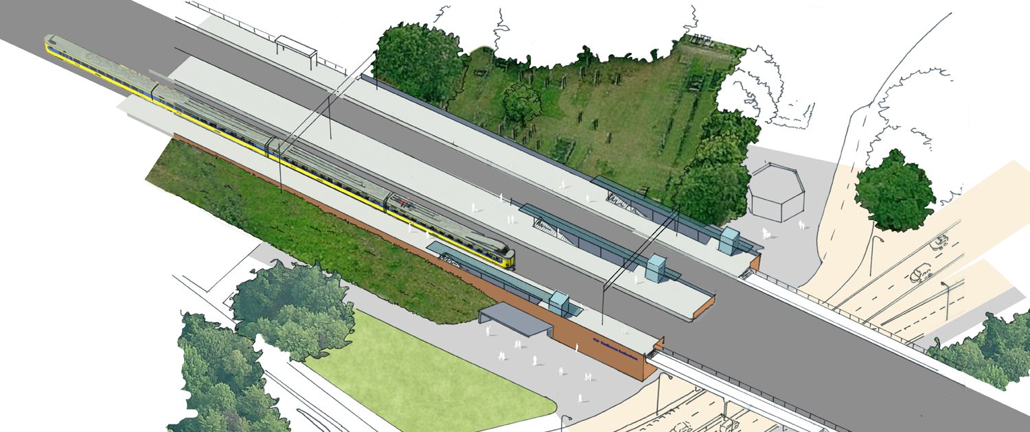
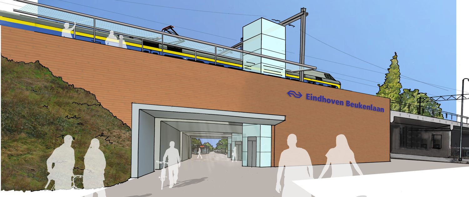
Station Eindhoven Beukenlaan
The Beukenlaan station was established in two phases and this is well reflected in the design and routing of the station. The station has a number of shortcomings in its current form. Rather also be a link between the districts, the station emphasize the separation. In addition, the routing is confusing and unclear. For waiting at the station are minimal facilities available and the whole makes a rather outdated and messy impression.

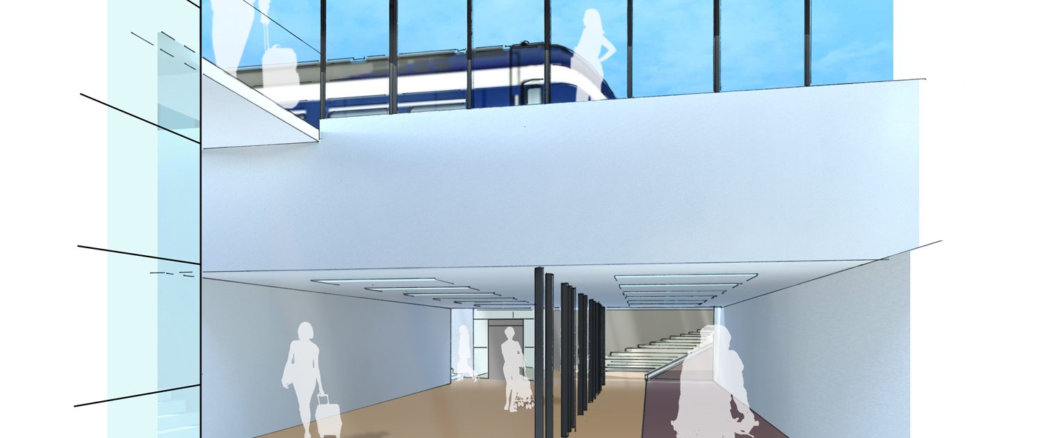
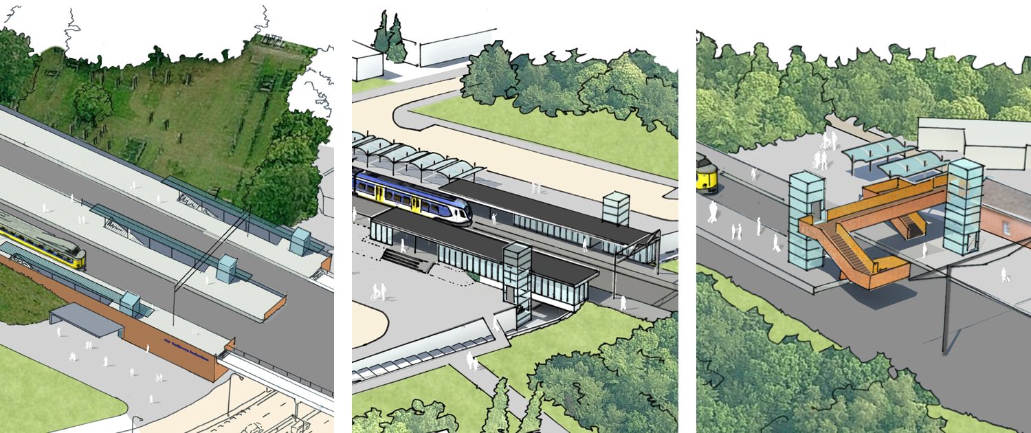
By creating a new, wide tunnel several goals are realized at once. Both on the side of the Beukenlaan as the Achtseweg South, an attractive reception area is created. The station is no separation but a connection. All platforms are using a clear, concise and thus socially safe route directly accessible from the tunnel. The three transparent elevators mark and anchor the station in its environment.

The new design is therefore more than just improving the accessibility of the station. It creates a whole new train station which is ready for the future.

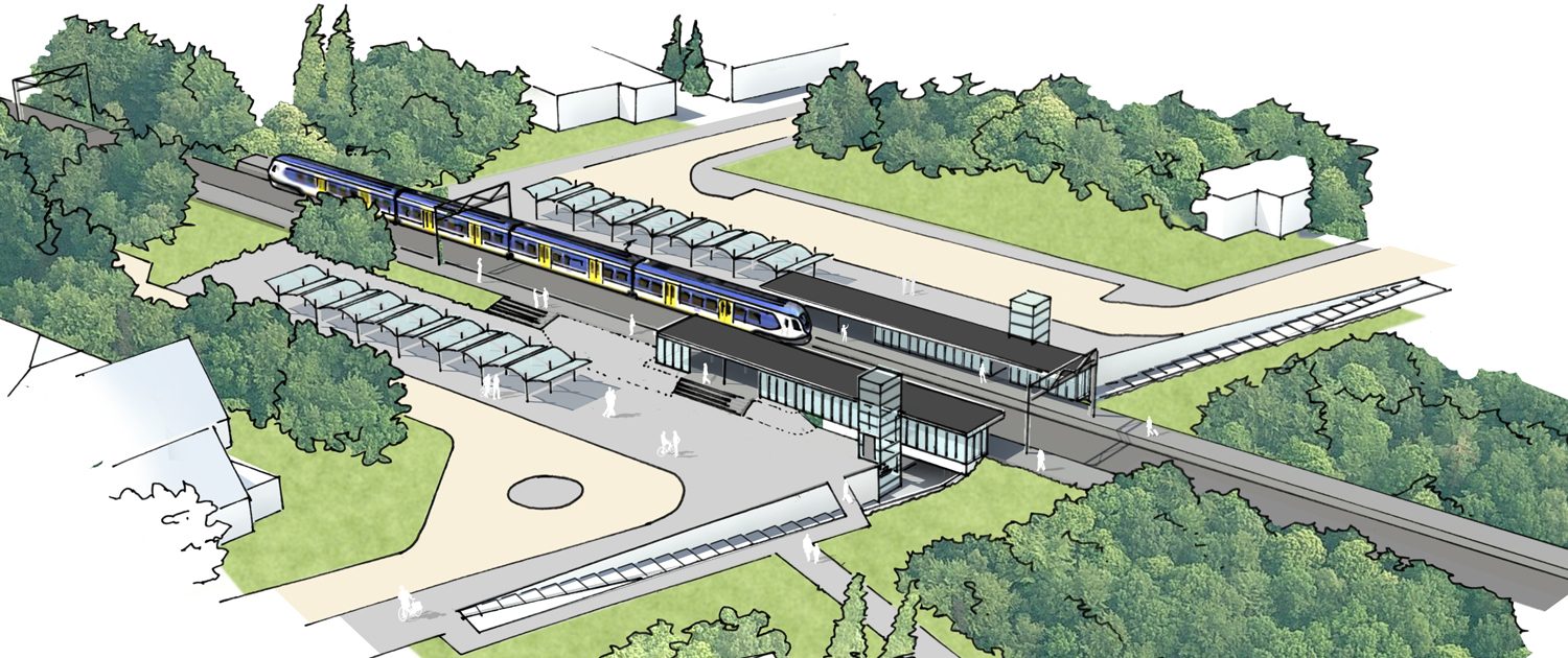
Station Heze
The Heeze station is located between two quiet, attractive residential areas with many detached and semi- detached houses. The station itself also reflects this: a nice -looking, peaceful, orderly and balanced station with a modest, simple waiting room. The station is present but subordinate to the hierarchy of the surrounding residential areas.

The two neighborhoods are linked by a cycle and pedestrian tunnel under the railway. From this tunnel, the two tracks are also available and is hereby part of both the station and the routing in the station, as well the route between the residential areas. The tunnel itself is outdated and no longer fully meets the requirements of the times and it also has not a clear view.

The new design enhances the existing qualities of the station and its connection to the surrounding tissue of the residential areas. Preserving the order and hierarchy. The existing tunnel and access will be improved, widened and thus organized and socially secure. The clear internal routing of the station is maintained. Placing lifts will improve the accessibility of the station and not disturb the “order ” and subordinate position of the station. The new lifts are pretty vertical elements to a further horizontal composition and thereby give the station a new , fresh look without being dominant.

Station Wolfheze
The station building has largely lost its station function, yet the view of the station, both from the north and the south side of the track, hardly changed. The sight is really only disturbed by the ‘abri’s’ that mark the entrance of the tunnel that leads to the island platform.

This tunnel is the result of the desire to eliminate the level access to the platform. The positioning of this tunnel right next to the regular crossing, however, creates a complex and therefore potentially dangerous situation. In addition, a direct access to the island platform on the track apparently can only be prevented, by providing a barrier between the rails. The tunnel fulfills no longer the requirements of the times and is particularly narrow and small.

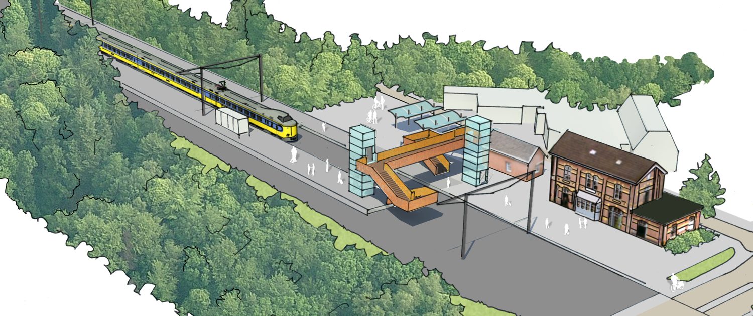
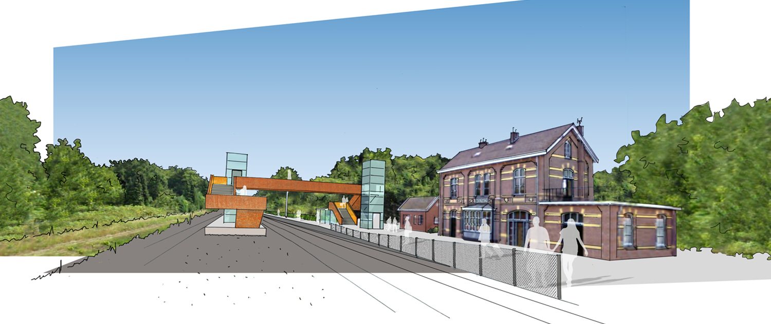
In the new design the tunnel and ‘abri’s’ are removed, and thereby the historical view of the station is restored from the north side. The existing crossing is again what it is; merely a level crossing. But a crossing in an orderly whole.

The space between the station and the track, the former access through the station building to the track, also regains significance as one of the entrances of the cross and the platform. The choice of a traverse is here obvious. There is enough space for and it can be easily inserted into the existing situation without being dominant. The materialization of the traverse closes here on by through the use of weathering steel.

The position of the traverse, including elevators and stairs is chosen such that it is a modern, self- addition next to the historic station building. The station building will retain its historic value. The new routing is bright and clear. The island platform is shortened on the side of the level crossing and the beginning portion of the platform will be located one piece further away from the crossing. The risk of a second, unofficial, route directly by rail to the island platform is thus highly unlikely.

LocationEindhoven, Heze, Wolfheze
Year2016
StatusPreliminary design (tender)
Client…, Utrecht
In corporation withStructon Worksphere, Utrecht
ImagesRuland Architects, Amsterdam
© Ruland Architecten 2024